This is what I categorize my wandering whims under! My mind may be wanting to write about life, blogging, music, movies, or anything under the sun, and if it doesn't fit into one of my other features then, well, here it goes!

I have a new blog design!
I have a new blog design!
Don't get me wrong, I really liked my old background - I thought it was pretty, and it was perfect for getting me started!
But, I really needed something new and refreshing, something I could really work with! I've been at blogging for just a little over a year, and wanted something at least slightly more professional looking, something a little more classy.
So, Saturday I kind of just randomly decided that I needed some nice social media icons, took about 3 hours to figure out which ones I wanted and get them set up, then one thing led to another. I really wanted a whole new design!
I thought, "hey if you're going to do this, just do it right and go all out!"
I knew that the colors I wanted my blog design to be were coral and mint green, because they are my favorite colors (along with purple, but I wanted coral and mint green), and just all around make me happy. Plus, they look really nice together in my opinion!
Then, I revisited Cutest Blog On The Block where I got my previous blog design, and started searching for coral and mint green. My new blog background is what I found, and even though it's not exactly the shades I wanted I hope it goes well enough with the rest of my blog design color scheme.
I honestly tried to create my own design, but I just couldn't seem to, so this will have to do for now.
I've recently been extremely interested in dividers, fancy frames, etc., that I really like. So, I started searching for some that I could use, but I had to pay for them. I continued searching, and finally figured out that you can find some to use when designing something in Google Drive, and that you can change the color really easily!
Enter all of my new feature, meme, Twitter, Google+, etc. images (Including my Twitter background, but I couldn't figure out how to add anything else to Bloglovin)! Maybe it would have looked nicer to stick with one design and just change the words, but I really liked all of these and wanted them all to look different - because each feature is unique and so I wouldn't get them confused - but still together. I did use the same coral color background with mostly the same 2 mint colors inside and the same Dancing Script font I used on my blog name and post titles, though.
Now I'll have
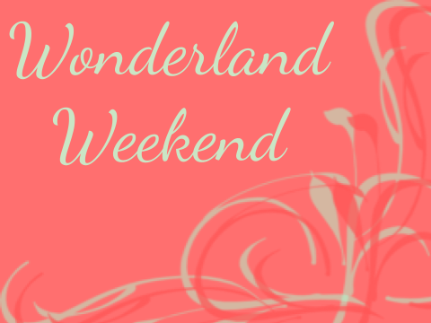

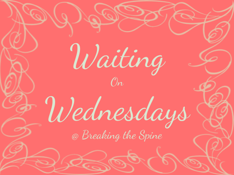
and

This revamping of my site and all of my social media is a huge change, but I really love the new color scheme, and the fact that I figured out how to make slightly nicer meme/feature images and social media icons!
P.S. I'm also thinking of adding a couple new randomly postable features, so, we'll see!
Any suggestions?
I'd love to hear from you guys, and please be honest!
Let me know what you think! Do the colors go together okay? Is the divider to much? Are the different meme and feature pictures okay or to different? What words would you use to describe this new look?
Also, please let me know if it takes my blog to long to load. It doesn't for me, but I would like to make sure it doesn't for you guys either!
But, I really needed something new and refreshing, something I could really work with! I've been at blogging for just a little over a year, and wanted something at least slightly more professional looking, something a little more classy.
So, Saturday I kind of just randomly decided that I needed some nice social media icons, took about 3 hours to figure out which ones I wanted and get them set up, then one thing led to another. I really wanted a whole new design!
I thought, "hey if you're going to do this, just do it right and go all out!"
I knew that the colors I wanted my blog design to be were coral and mint green, because they are my favorite colors (along with purple, but I wanted coral and mint green), and just all around make me happy. Plus, they look really nice together in my opinion!
Then, I revisited Cutest Blog On The Block where I got my previous blog design, and started searching for coral and mint green. My new blog background is what I found, and even though it's not exactly the shades I wanted I hope it goes well enough with the rest of my blog design color scheme.
I honestly tried to create my own design, but I just couldn't seem to, so this will have to do for now.
I've recently been extremely interested in dividers, fancy frames, etc., that I really like. So, I started searching for some that I could use, but I had to pay for them. I continued searching, and finally figured out that you can find some to use when designing something in Google Drive, and that you can change the color really easily!
Enter all of my new feature, meme, Twitter, Google+, etc. images (Including my Twitter background, but I couldn't figure out how to add anything else to Bloglovin)! Maybe it would have looked nicer to stick with one design and just change the words, but I really liked all of these and wanted them all to look different - because each feature is unique and so I wouldn't get them confused - but still together. I did use the same coral color background with mostly the same 2 mint colors inside and the same Dancing Script font I used on my blog name and post titles, though.
Now I'll have
and
This revamping of my site and all of my social media is a huge change, but I really love the new color scheme, and the fact that I figured out how to make slightly nicer meme/feature images and social media icons!
P.S. I'm also thinking of adding a couple new randomly postable features, so, we'll see!
Any suggestions?
I'd love to hear from you guys, and please be honest!
Let me know what you think! Do the colors go together okay? Is the divider to much? Are the different meme and feature pictures okay or to different? What words would you use to describe this new look?
Also, please let me know if it takes my blog to long to load. It doesn't for me, but I would like to make sure it doesn't for you guys either!
No comments:
Post a Comment
I would love to hear your comments! I will reply to all comments that make a reply form in my mind, so if you have a question, comment, or something to say, feel free to do so!